
Finding a look for The Way of Markdown
The site has a new design: one orange, a serif for reading, mono for structure, a brush-stroke # for a logo and a roadmap that moves. Here's how we got there, wrong turns included.

The site has a new look. One orange, a serif for reading and a monospace for structure, headings marked with a ## the way you'd type them, and a brush-stroke # in an orange square for a logo.
Getting here took two days and more wrong turns than I'd like to admit, so here's the story. Partly because it's useful to me to write down, and partly because "how do you find a look for a thing" is a question I get asked and rarely answer honestly.
Where we started
The first version of this site had an accent colour I never chose. It was green because the roadmap used green for "built", and the theme was whatever Flowershow gave us with a few tweaks. The hero was a short tai chi video I'd made with Gemini. All fine, none of it decided.
Too many options, then too few
The first proper attempt was a brief with six visual directions: a manual, a field guide, a dojo, a poster, a notebook, an editorial look. Six was far too many. None of them landed, and I couldn't say why, which is usually a sign the options are variations rather than real choices.
One of them, a clean blue "technical manual", I liked. That got taken as a decision, and the next round was three versions of the blue manual. Too narrow, and on reflection a bit cold. I like X is not the same as X is decided, and I've learned to say which I mean.
Looking at real things
So we reset. Instead of inventing directions, we gathered a gallery of real sites I admire and I gave each a verdict. Devouring Details for its calm textbook layout. Making Software for its beautiful technical drawings. Sketchplanations for explaining things with a few lines. Apple's colour choices. A few others I liked for one detail each.
From that came three "feels": a manual, a textbook and a sketchbook. I picked the textbook layout with sketchbook drawings, and orange arrived as the one colour. It looked good. It still felt a little cold.
Copying ourselves
The fix turned out to be next door. Way Into AI, a sister site, had a design I kept coming back to: Newsreader for the words, IBM Plex Mono for the structure, generous spacing, hairlines instead of boxes. It's very readable. So we copied it, and swapped its blue for our orange so the two sites look like siblings rather than twins.
From Making Software we borrowed two things: the dotted-leader contents list on the front page, and the style of the front-page drawing, a markdown file pulled apart into its layers.
The logo
The # was always the obvious mark. It's the most recognisable character in markdown and it works at 16 pixels. The question was how to draw it. A pixel # (borrowed from Making Software's typeface) said "retro computer", which is their story, not ours. The brush # looked lovely on its own but clashed next to a plain title. Cutting the brush # out of an orange square, like a seal, fixed that and gave us a favicon that reads at tab size. I'm not certain it's final; there's a round version to try. But it's good enough to ship.
The tai chi figure is out as a logo. It never worked small. The Way still matters, it just lives in the name and the writing rather than the mark.
Diagrams
The roadmap got the same treatment and taught us something. First I redrew it in the style of the front-page figure: stages as floating layers, side trips as labels. It looked gorgeous and was useless, because a roadmap is about branching and that style is for showing the parts of one thing. The labels read as captions, not places you can go.
So now there are two kinds of diagram. "Anatomy" drawings show what's inside something. "Map" drawings show a route: a spine, stops on it, side trips off it. The roadmap is a map, and it moves now. A little ball walks the route, each stage lights up as it arrives, and there's a small burst when you reach the end.
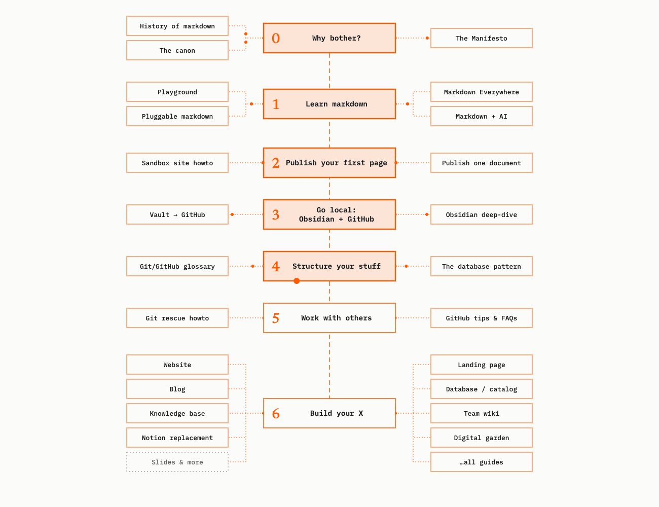
All of it is generated from plain text: the roadmap from a JSON file, the drawings from small scripts. Hand-drawn diagrams rot. Generated ones stay current. Plain text wins again.
What's not done
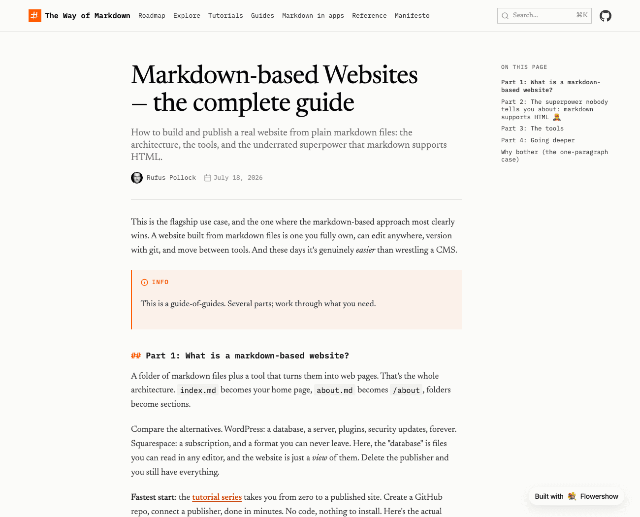
Flowershow can't yet do everything the mocks did. There's no hand-picked left-hand contents (Use it / Learn it / Why), no reading time, no "last updated" date, and breadcrumbs only show on mobile. We've filed those as feature requests, which is the nice thing about eating your own cooking. The guide pages are already a lot better for the new type and callouts:
Still to come: settling the logo, more diagrams on the guides, and a look at whether the front page should read more like a chapter, the way Making Software's does.
If you spot something broken, or just ugly, tell us on GitHub.
